Juno Usage Guide
Introduction
Juno is a progress bar block plugin with customizable circle, square and semi-circle shaped progress bars.
Juno offers completely customizable circle, square, and semi-circle progress bars. Tailor the content, colors, and more to align perfectly with your website’s design and branding. Enjoy a range of animation options and many more features, all while benefiting from its lightweight nature and adherence to core WordPress standards for seamless integration and optimal performance.
Pattern Presets
Juno provides convenient ready-to-use patterns for effortless application.
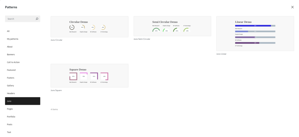
Search for “Juno” in pattern/block inserter and the ready-made presets should be available for effortless insertion so that you can get a head-start.
Options
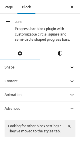
Most default WordPress blocks offer two tabs: “Settings” and “Styles.” Similarly, the Juno block also presents its options in these two tabs.
The “Settings” tab includes options for “Shape,” “Content,” and “Animation.”
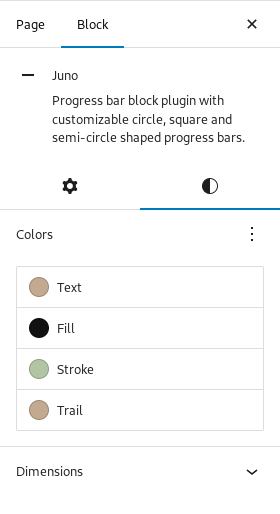
The “Styles” tab provides options for “Colors” and “Dimensions.”
Settings
Settings tab includes options for Shape, Content, and Animation.
1. Shape
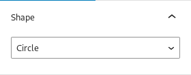
You can modify the shape of the progress bar to one of the following options:
- Line – Change shape to a straight line
- Circle – Change shape to a full circle
- Semi Circle – Change shape to a semi circle
- Square – Change shape to a square
Additional shapes will be introduced in future updates.
2. Content
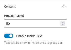
You can change the value of percentage/percentile and choose to show/hide the percentage on the bar
Percentile(%) – Input the progress bar value
Enable Inside Text – Choose whether to show or hide the percentile on the progress bar
3. Animation
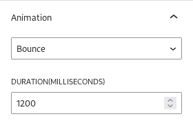
Choose the type of animation you want for the progress bar along with the duration of the animation.
Duration(milliseconds) – Time in milliseconds for the above chosen animation to be finished. By default it is 1200 milliseconds
Animation – Choose whether you want Bounce or Linear effect
More animation options will be introduced soon.
Styles
Styles tab includes options for Colors and Dimensions.
1. Colors
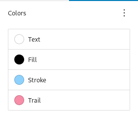
You can change the color of each part of the progress bar.
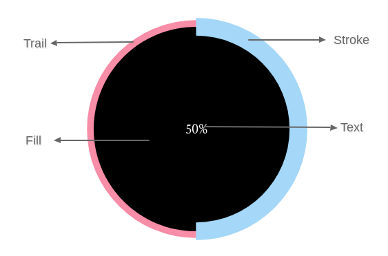
- Text – Color of the percentile set
- Fill – Color of the main part of the shape ( Not available in Line shape )
- Stroke – Color of the animated part
- Trail – Color of the part over which animation occurs
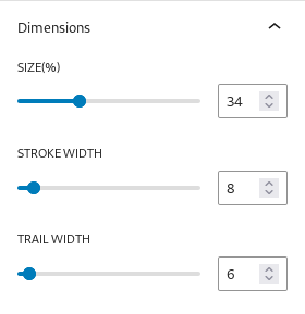
2. Dimensions
You can change the dimensions/size of each part of the progress bar.
- Size – Overall size of the progress bar ( in percentage )
- Stroke Width – Width of the animated part ( in pixels )
- Trail Width – Width of the part over which animation occurs ( in pixels )
Get Support
If you still have questions or need assistance after reading this document, please don’t hesitate to contact our support from our Support page.